Making Business Cards Worth the Decision: Redesigning How Vistaprint Customers Discover and Choose
Business cards are Vistaprint's flagship product. They're also one of the most deceptively complex purchasing decisions on the platform — dozens of options, finishes, formats, and upgrade paths that customers have to navigate largely on their own. We'd been hearing for a while that the experience wasn't working. Customers were calling it cumbersome. Painful. Those aren't words you want associated with your most important product.
As part of Forge, Vistaprint's internal UX consultancy, I led a structured multi-sprint research and design engagement to find a better way. Working with a core team of product, UX, and business card specialists, we set out to answer a question that sounds simple but isn't: how do you help every kind of business card customer arrive at something they'll love, without making the journey feel like work?
UX Research • Product Design • Creative Direction
Project recap video: ~5mins
What We Delivered
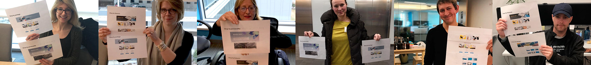
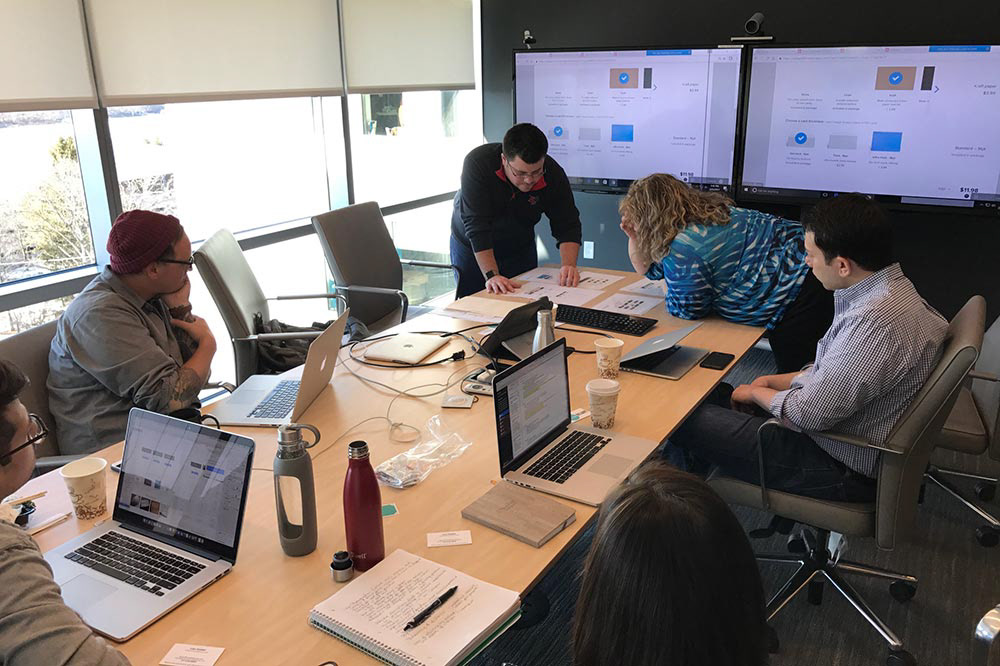
A research-backed UX and IA recommendation for the Vistaprint business card experience, developed across five sprints, approximately 20 tested prototypes, and six weeks of collaborative work with product, engineering, and business card stakeholders. Findings and recommendations were packaged into weekly sprint summary updates for stakeholders throughout the process, keeping leadership informed and aligned at every stage.
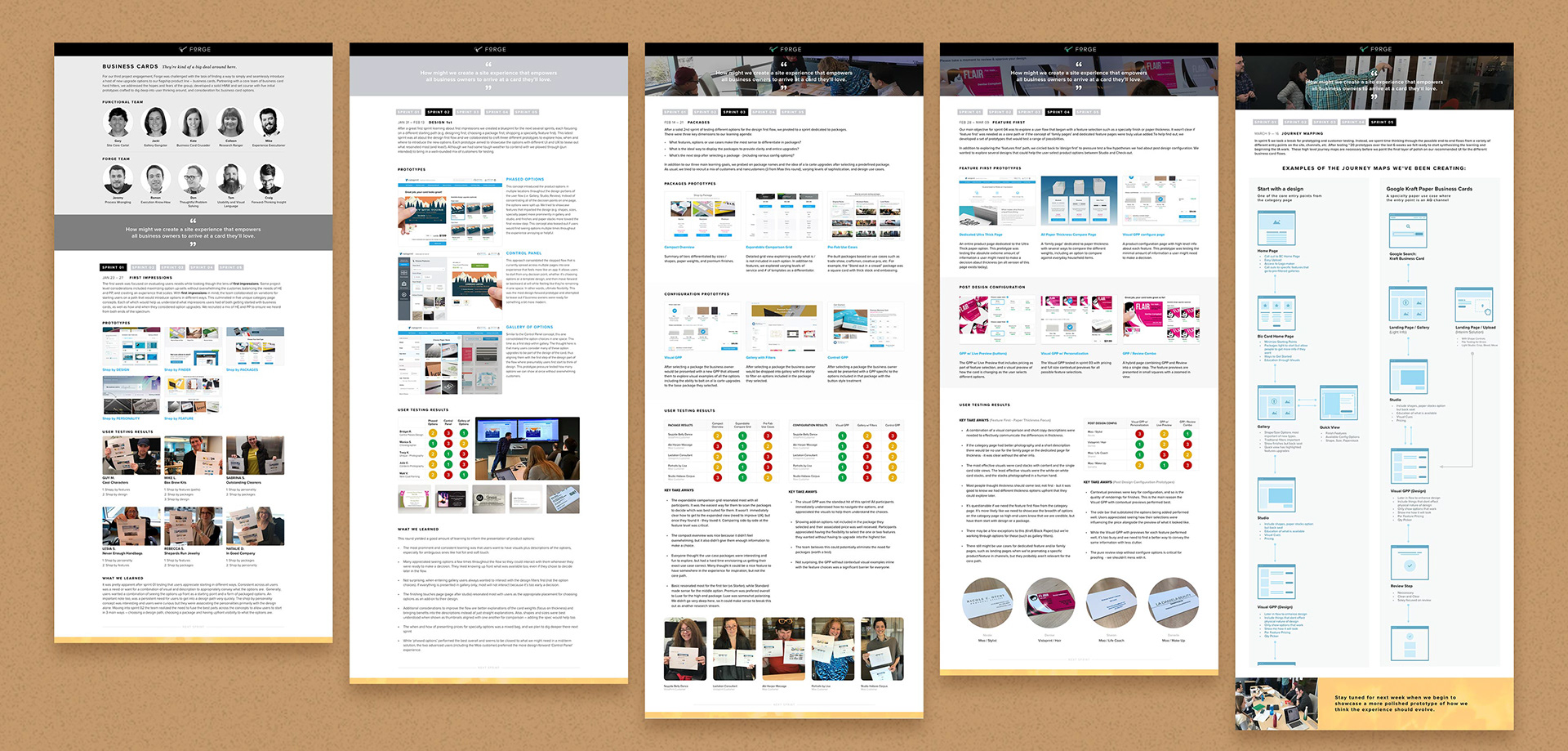
Weekly sprint recaps were shared with stakeholders and the executive team.
Defining the Problem
Before we touched a prototype, we needed to understand who we were designing for. Business card customers aren't a monolith. A premium buyer who suspects Vistaprint only sells cheap cards has completely different needs than someone who just wants a clean, simple card and a fast checkout. A customer with a design already in mind is navigating the experience differently than someone who's still exploring what's possible.
We framed our work around four distinct user stories that captured this range, from the skeptical premium customer who needed to quickly assess whether the product line could meet their standards, to the design-first customer who wanted to get into the gallery immediately and make option decisions from there. These stories became the lens through which we evaluated every prototype we built.
Our project hypothesis was straightforward: how might we create a site experience that empowers all business owners to arrive at a card they'll love?
Sprint 01: Understanding First Impressions
We started where every customer starts — the moment they land on the category page. The team developed five distinct concepts, each introducing upgrade options in a different way, to understand what impressions users formed about both getting started with business cards and how and when they were open to considering upgrades.
This sprint wasn't about finding the right answer. It was about understanding the range of first impressions the current and potential experiences created, and using those reactions to sharpen our direction for everything that followed.

Sprint 02: Following the Design-First Customer
With first impression insights in hand, we shifted our focus to customers who wanted to start designing before making product decisions. We built and tested three distinct flows: an overlay gallery of options, a progressive disclosure model with real-time visualization, and a fly-out control panel approach.
Each represented a meaningfully different philosophy about when and how to surface complexity. Testing this range gave us clear signals about which customers wanted options presented upfront and which needed to feel like they were already making something before committing to the details.
Sprint 03: Exploring Package Structures
Midway through the engagement we pivoted to a dedicated sprint on packaging — one of the most strategically important questions of the project. We were trying to understand three things: which features and options made the most sense to bundle, how packages should be displayed to provide clarity while encouraging upgrades, and what the right next step looked like after a customer selected a package.
We also probed on package naming and tested the idea of à la carte upgrades after a predefined package selection — a nuance that turned out to matter more than we initially expected.

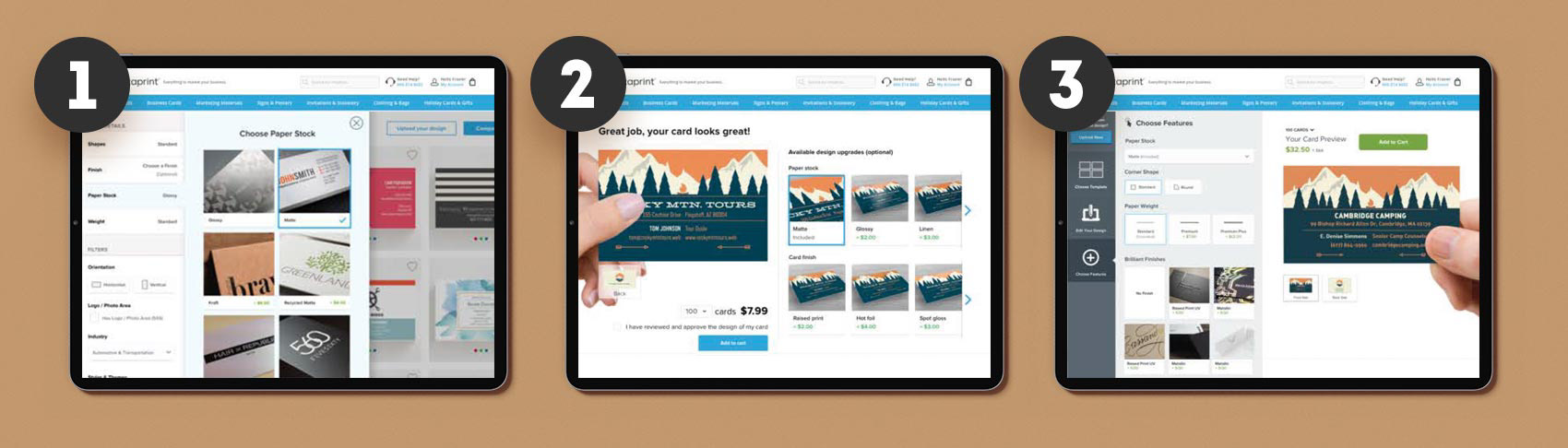
Sprint 04: Testing a Feature-First Entry Point
Not every customer starts with a design. Some start with a specific feature — a specialty finish, a particular format — and work backward from there. This sprint explored whether a feature-first flow was a meaningful alternative path or a distraction from the core experience.
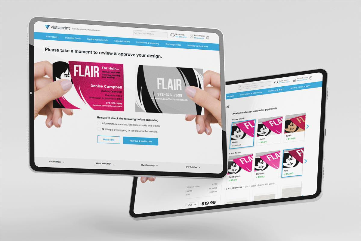
What we learned was decisive. Contextual previews were critical for configuration decisions. The quality of finish renderings mattered enormously. Customers needed to be able to see what they were choosing, not just read about it. The Visual Gallery Product Page with contextual previews consistently outperformed the alternatives — and the need for a pure review step without configuration options emerged as an important finding for customer proofing.

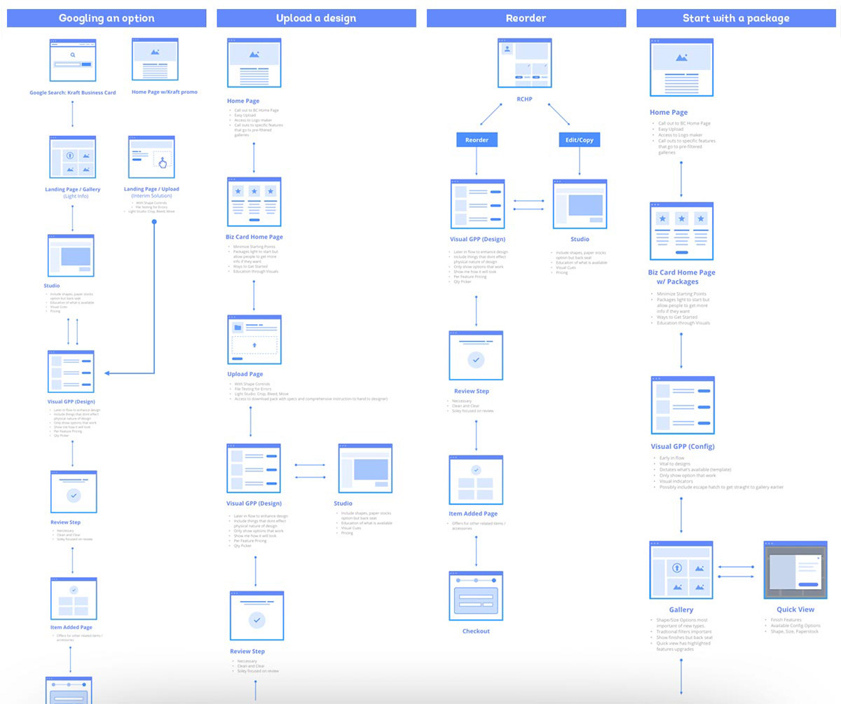
Sprint 05: Synthesizing Into a Journey
After testing roughly 20 prototypes across six weeks, we had more than enough signal to start making decisions. Sprint 05 was about synthesis — pulling the learnings together into high-level journey maps that would serve as the foundation for the final IA and UI recommendations.
This was the step that turned weeks of divergent exploration into a coherent point of view. The journey maps made it possible to see the full experience as a customer would live it, identify where the friction points were, and build a case for the recommended design direction we would take to leadership.